Positioning
In response to the Charles Sturt University Library’s push campaign, this project delivers student-centric, digital-first assets that emphasise smarter study, connection, and cultural engagement, aligning with CSU’s brand identity.
The first asset is a banner featuring the slogan “Big Brain Energy” to promote the library’s online tools positioned on the library’s home page. I followed the CSU brand colour guide but picked brighter, more vibrant options within the approved palette to craft a design that feels energetic and less corporate.
The graphic language provides a strong visual backdrop that grabs attention, while the bold typography ensures the slogan remains the focus. Positioned as the campaign’s key piece, the banner conveys student-focused messaging in a high-visibility format. Its purpose is to spark curiosity, raise awareness, and guide students towards CSU’s digital library services. By balancing professionalism with a more colourful, approachable style, it highlights smarter study and positions the library as a dynamic and supportive space for students.
The second asset is a series of four Instagram story tiles designed to highlight key offerings, particularly the online librarian chat service. One tile playfully references Dolly Parton’s lyric “working 9–5” by rephrasing it as “2–5,” a creative twist intended to be a scroll-stopper that captures attention and resonates with student culture. The series communicates in short, bite-sized formats optimised for mobile-first viewing, maximising engagement while minimising distraction.
This platform-specific content leverages where students already spend their time: according to Schaefer (2025), 89% of Gen Z social media users are on Instagram, 84% on YouTube, and 82% on TikTok. The decision to focus on Instagram stories reflects CSU’s high proportion of online students and positions the library as digitally accessible, relevant, and responsive to student culture.
Across both assets, the aim was to create content that feels culturally engaging, not just practically informative. I intentionally avoided overly corporate or cluttered visuals in favour of clean, minimalist layouts that enable the messaging to stand out. Typography, colour palette, and graphic language from the CSU brand kit were applied consistently to establish credibility. Simultaneously, the playful slogans and friendly tone connect genuinely with a Gen Z audience.
In conclusion, both assets address the brief with student-centric messaging, platform-specific design, and a tone consistent with CSU branding. The banner acts as a bold, high-visibility reminder of services, while the Instagram story series encourages playful, mobile-friendly interactions that reflect student culture. Together, they demonstrate that the CSU Library is not just a functional service, but a lively and supportive space that helps students connect, succeed, and study more effectively.
Media Asset #1
Content: Digital Web Banner
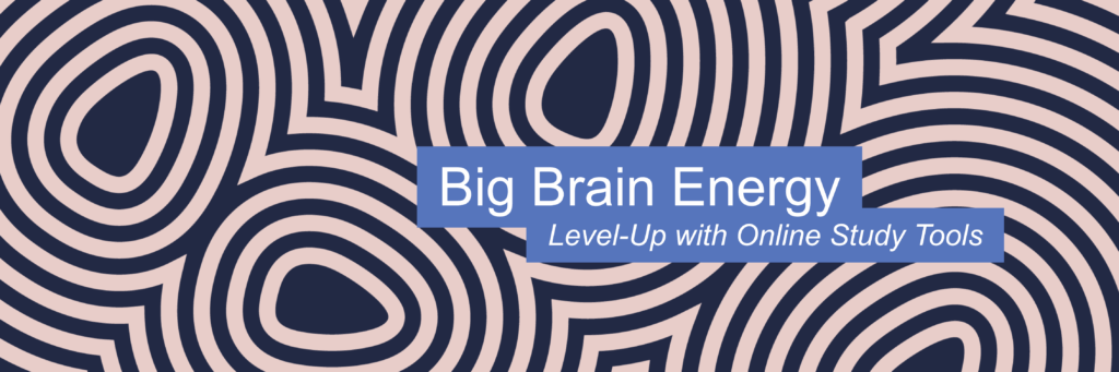
About: Its purpose is to spark curiosity, raise awareness, and guide students towards CSU’s digital library services.
Media Asset #2
Content: Instagram Story Set
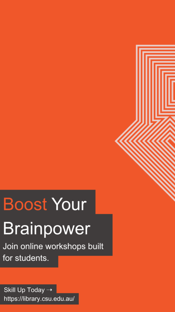

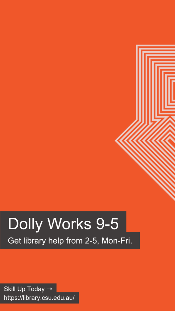
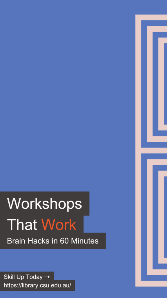
About: This Instagram series communicates short, bite-sized formats optimised for mobile-first viewing, maximising engagement while minimising distraction.
View Team Content